Design, Sculpting And 3D Printing
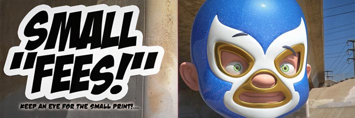
Small Fees! Evil Comes in Small Sizes
The making of a Character for a Spec Spot
Concept
Small Fees is a Spec Spot for my Demo Reel. The next page is a “diary” of the project, from the Story, Concepts to the Production…
The Synopsis for Small Fees, is that they are a metaphor for the “small hidden fees” you tend to find in any legal contract - a House Loan in this case. So my metaphor for these “fees” are tinny “Lucha Libre” wrestlers. that come to life and “bite” a first-time home-buyer...
1) Reference Sheet(s)
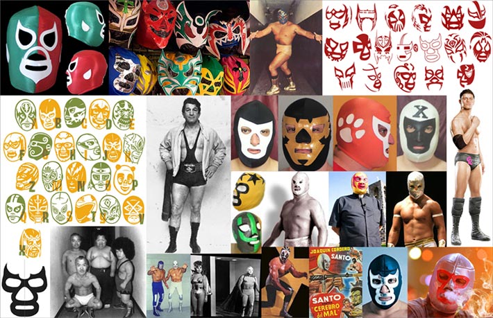
Here are the Reference Sheet I created for Small Fees…
I decided to search for unique, but iconic images of anything to do with Wrestling: Lucha Libre, W.W.F., etc...
2) Masks Color Design
Here are some quick color comps for the Small Fees Masks’ colors...
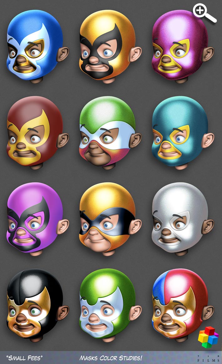
These were all done in Maya & Photoshop:
1) In Maya, a made two renders of the Model: a) a quick rendering of the Model using Maya’s default Lambert Shader, so as to give me a neutral Grey base color, and b) for the masks, I created a “pleather” texture (Plastic+leather = Pleather!) similar to car upholster, or materials found in Professional Wrestler’s outfits, my best bet for that was Mental Ray’s Car Phenomenon. I then tweaked the Flake Color’s Exponential, Density & Weight to a ridiculous size!...
Do you see where the Reference Sheet(s) come in handy?!...
2) In Photoshop a then used Dodge & Burn ot “sculpt” the volume...
3) I then composed the render textures in Photoshop, and went to town with the Layers’ Modes...
3) Printing
For the 3D Printing, we sent the first prototype to Purple Porcupine. We chose this to get a “master” print as a proof-of-concept on the quality. Purple Porcupine is the Service Bureau side of Purple Platypus, a subsidiary of Stratasys, the makers of the best 3D Printers in the industry. We used a Object 30 Pro Printer for this li guy:
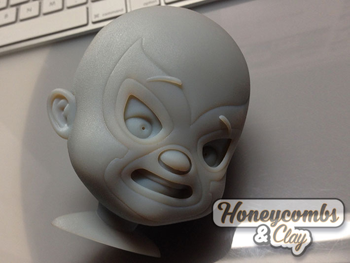
Then I printed another head using my Formlabs Form +1, to compare it to the highland proof-of-concept…
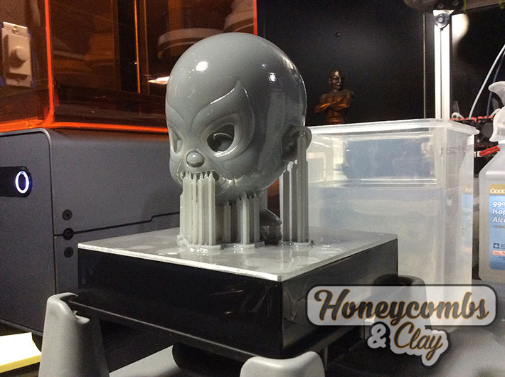
You can see hoe the printing-plate (upside-down with the head) is covered with liquified resin…
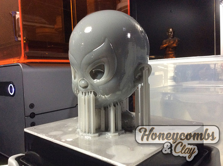
In this close-up, you can see the striation of the printing. The higher the quality, the thinner the lines, but remember: they are always there! This was printed at a low resolution of 200 microns…
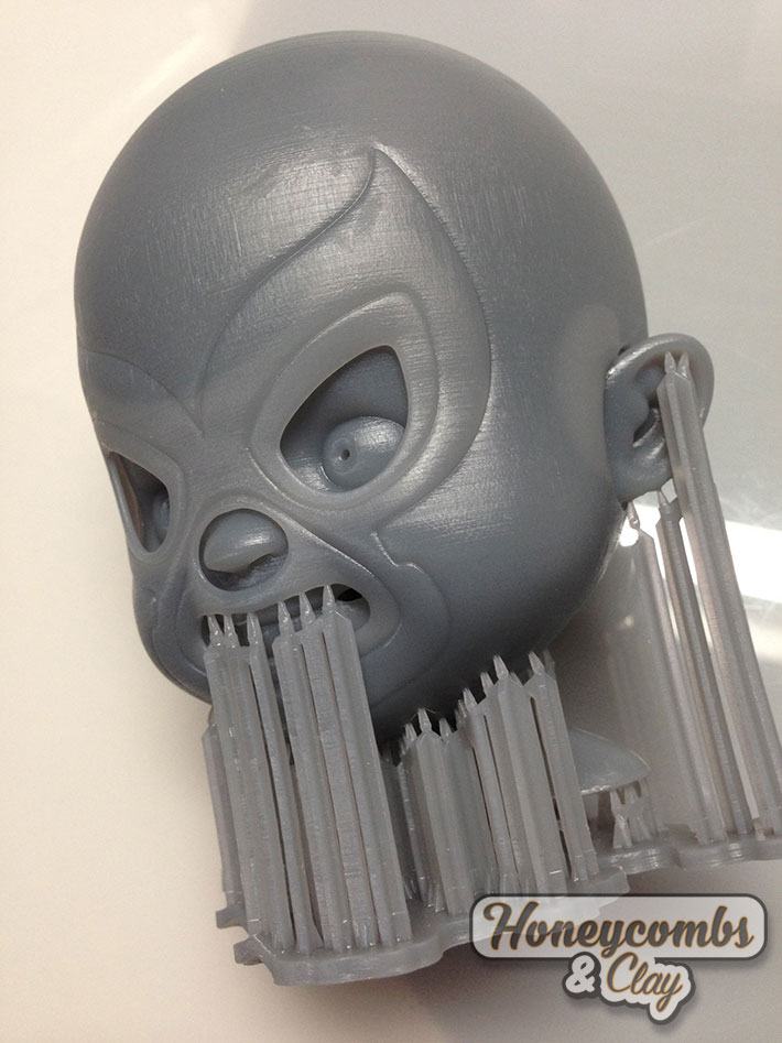
Here is a close-up. The “lighter” pockets in the print are air-pockets! I made the wall-thickness to be 2mm…
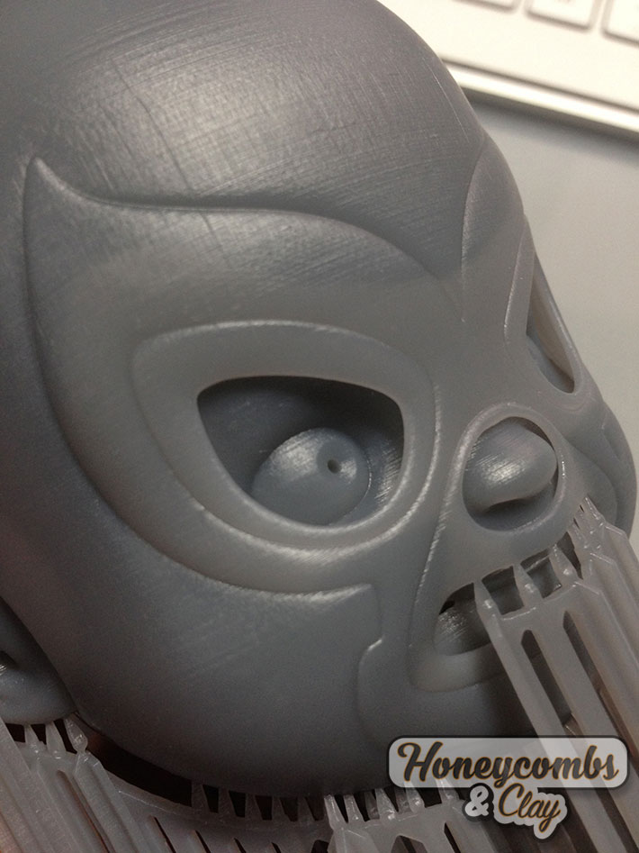
Another view of the print.You can see the air-pockets around the face, specially near the nose!…
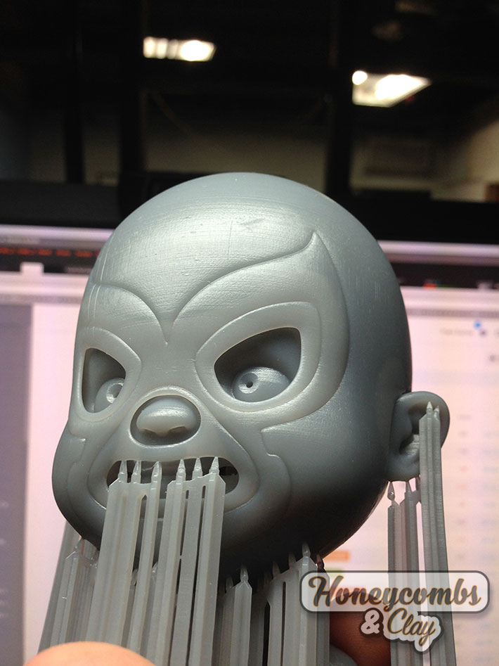
The main difference between the print from Purple Porcupine and the one from the Formlabs Form 1+ is that the prior has a “softer” surface, since they use a “water-blaster-like” machine to eliminate the supporting wax, thus creating a “sandblasted” texture. For the one from the Formlabs Form 1+, you have to use wet-sanding to get rid of the striation…
More to come!
Cheers!